Serpentine Cider - Branding & Packaging
Sean took his hobby and turned it into Serpentine Cider. The mark is inspired by Southern California’s native diamond back rattlesnake and pays tribute to Sean’s roots as an environmental field biologist.
We made the decision to refrain from creating a menacing looking snake as they are often misunderstood to further support Sean’s good nature and all-inclusive attitude. The custom font also mimics the slithery movement of snakes which ties the whole thing together quite nicely.
Primary & Alternate Logos


Custom Lettering


Label Design - Crowler Cans
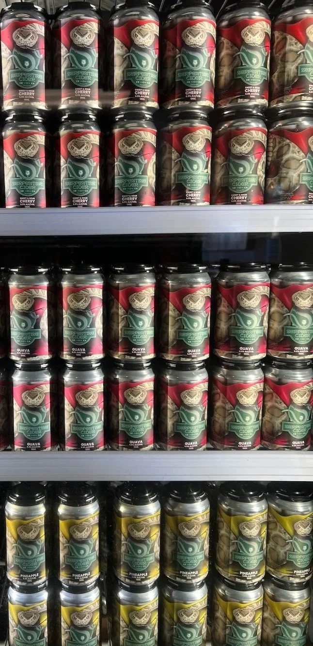
The CORE FOUR!!! Sean came to me with the challenge of getting the label to look like this rattler was crushing the can! The pop of colour was also fun to dial into, sampling lots of different photos of actual fruit until I got the tone and contrast I wanted. Took a couple iterations to get there but pretty stoked with how this effect turned out, and more importantly so was Sean!
Label Design - Crowler Cans
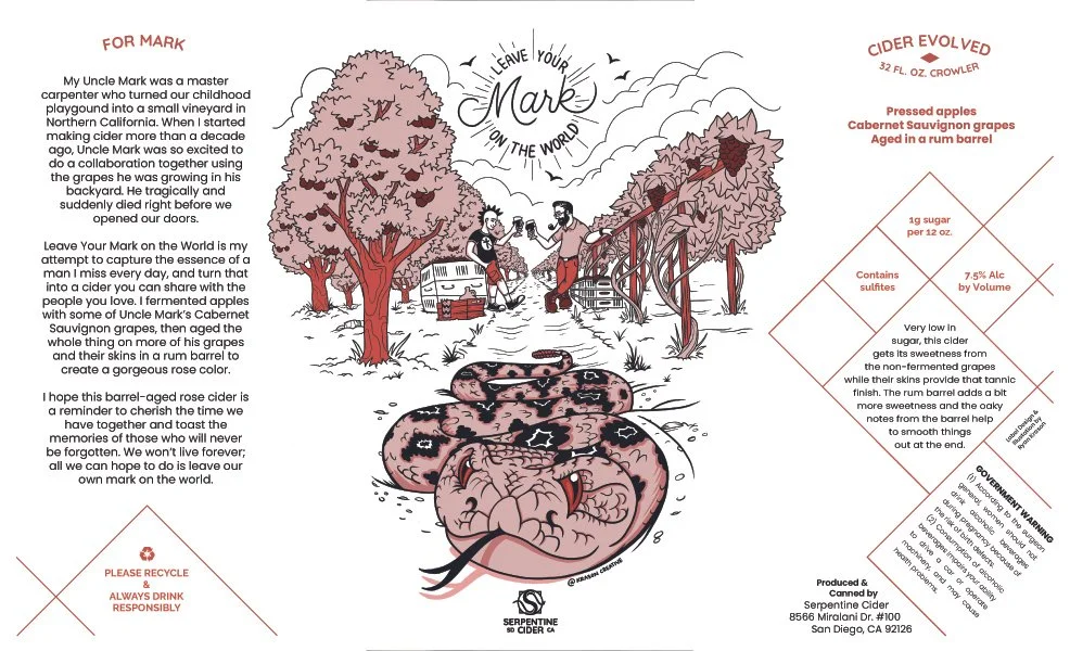
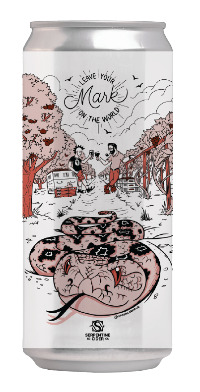
This was a special project and tribute to Sean’s uncle, Mark who passed away before they could get the chance to collaborate on a cider. The story is all there on the label. The design also includes subtle nods to Uncle Mark’s contracting background and a soft and simple aesthetic that let’s the illustration shine to remind us all to cherish the time we share with our loved ones.
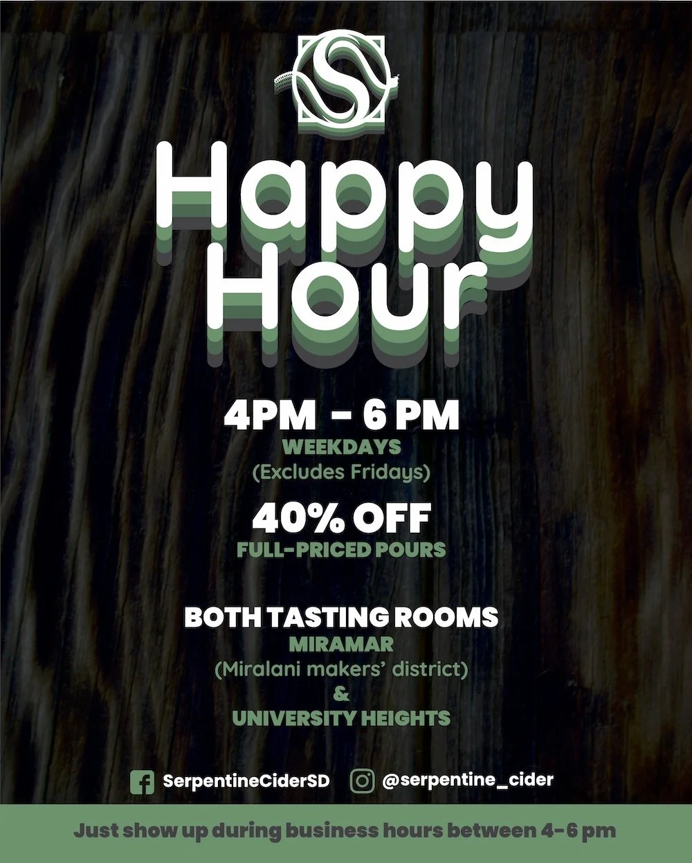
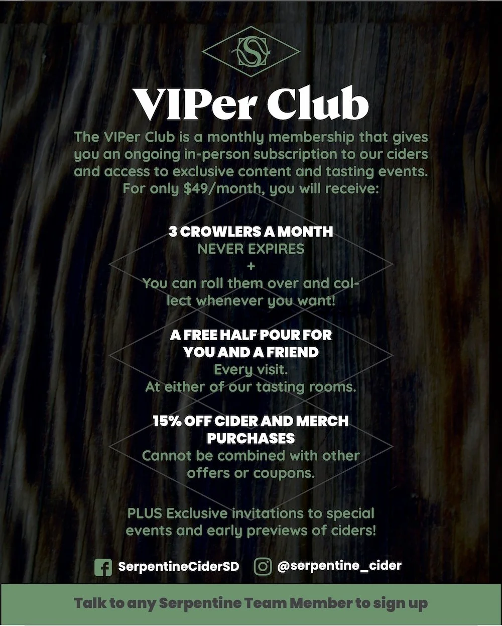
Promotional Materials
Tabletop flyers for Serpentine’s VIPer Room & Happy Hour Flyers