Hot Like a Mexican - Logo Design & Brand Identity
I’ve been working with Andres for 4 years helping build his brand of delicous, authentic Mexican Food. Hot Like a Mexican wanted to take its brand somewhere fresh, bold and exciting; much like the flavous that define Chef Andres Pimentel’s famed tacos, burritos and quesadillas.
Logo & Food Lock Up

Primary Logo
Logo Options
The first logo depicts the man himself. Andres wasn’t initially keen to use his face in the logo, but since he had it plastered all over his menus and socials, I thought it may be time to give good ‘ol Colonel Sanders a run for his money.
The second logo has become the primary logo for Hot Like a Mexican. Simple, Bold with plenty of personality that reflects the man behind the delicious food. The third is an even simpler approach to the text based logo.


Menus

WOMAD Menu

Waterfront Menu (Standard)

Waterfront Menu (Specials & Contract Info)
Willis Lane Menu & Signage
After a move from the Waterfront to Willis Lane, Hot Like Mexican shifted their colour palette to fit in with the venue’s general and simplified aesthetic.


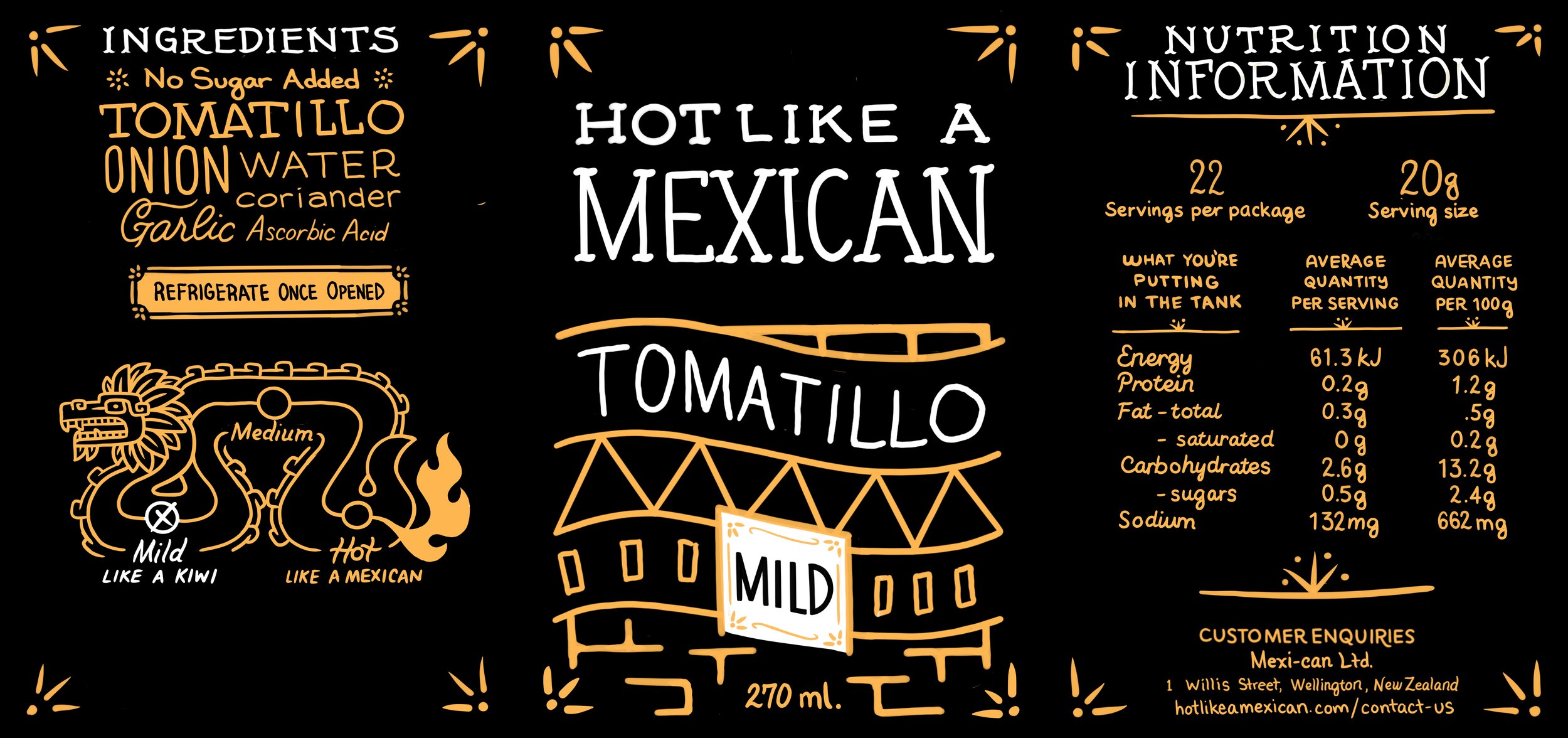
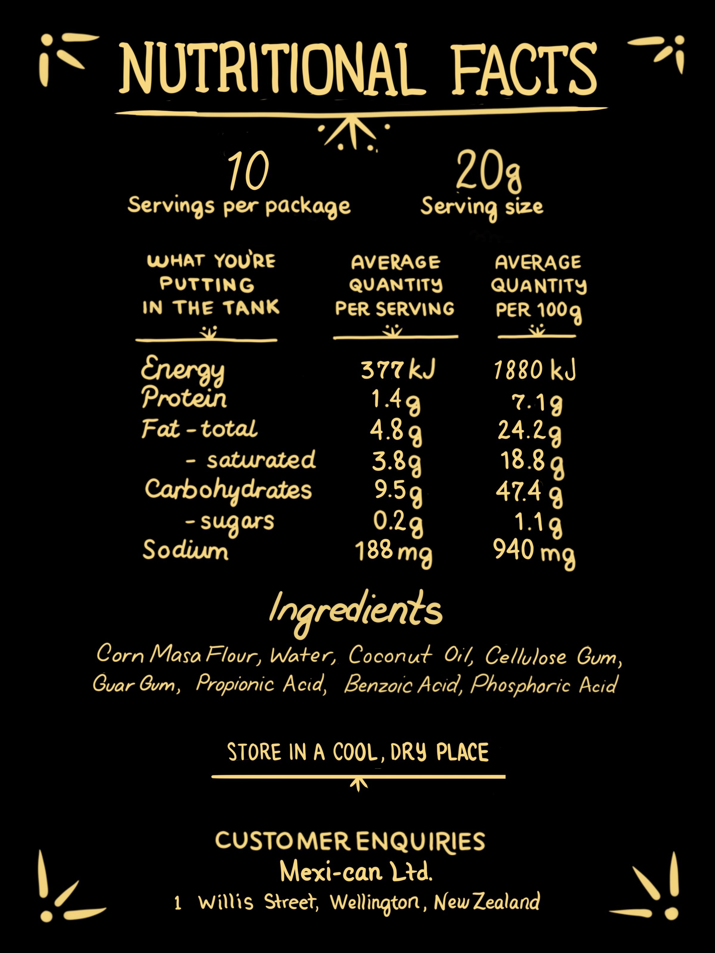
Label & Packaging Design
Working to get his salsas into the supermarkets, Andres and I worked closely on coming up with a series of labels that were hand drawn to highlight the handmade quality of his foods, while injecting a bit of humour with the gassy dragon that denotes how spicy each of his salsas are.